/ Hydra /
Client: WARRUNT HUB / Project type: VISUAL IDENTITY
I was invited to put together an identity for HYDRA - an extraordinary project aiming to better understand how using hydrogen on a large scale for energy or industry might affect the climate, identifying benefits, risks, and ways to mitigate problems.
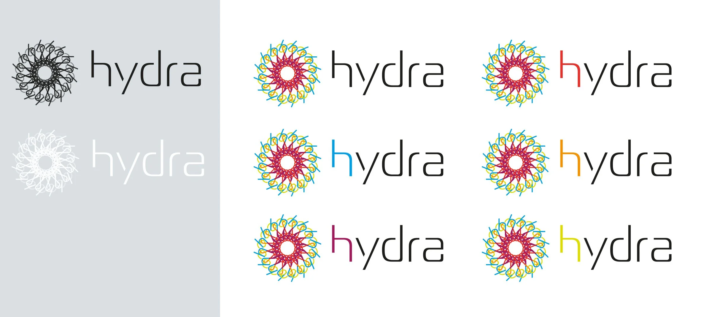
So I created a logo mark paired with elegant and futuristic custom made sans serif lettering for the project name. The logo suggests layered information - the idea of energy, dynamism, multiple variants, natural elements. The concepts for it stems from the letters of the name hydra combined in a circular wheel. Each letter is in a specific color as symbols of Hydra’s key elements: air, water, fire, earth, energy.
In addition, the institutional logo, is adapted into five different versions, where the initial 'H' is represented in the color of each element.
The identity includes the logotype, icons and infographics. I created also promotional material for them: brochure, a book with a part dedicated to meeting calendar and space for notes for each meeting , a poster and roll-up for launch event.
Graphics and concept: ©Stefania Trofino for Warrant Hub