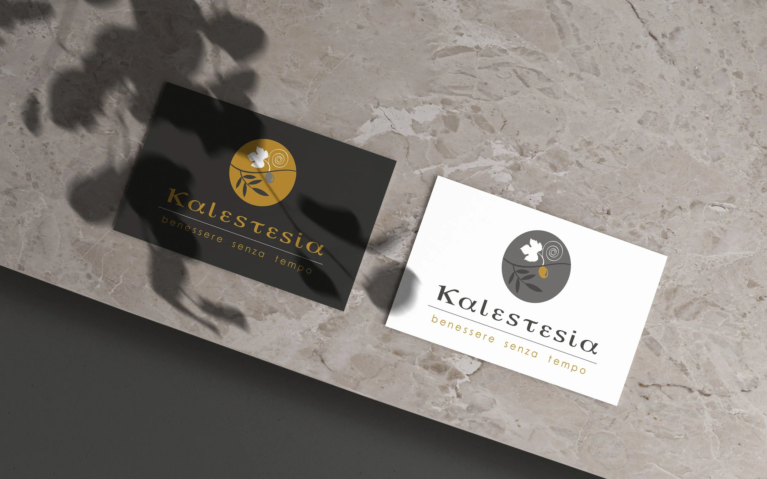
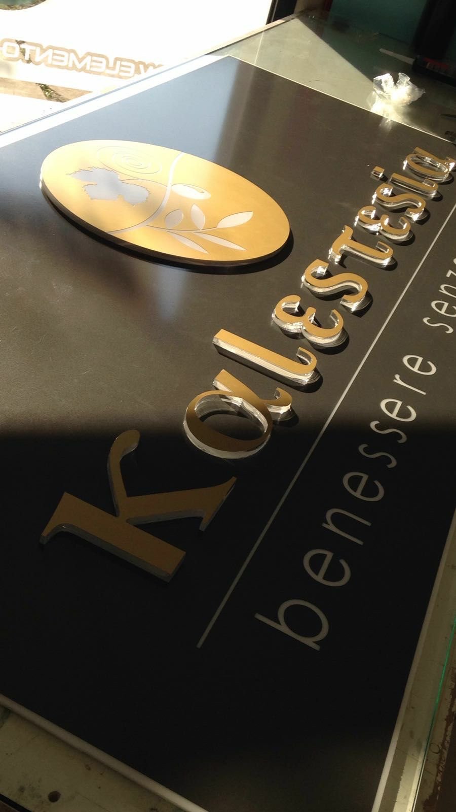
/ kalestesia /
Client: Kalestesia —- Project Type: BRAND & CORPORATE IDENTITY
I was invited to create the brand identity for the wellness and beauty center Kalestesia - whose name originates from the greek KALÓS-AISTHESIS, meaning ‘perception of beauty through the senses’. Through the use of polished color palette of gold, white and grey, specifically created typography reminiscent of ancient Greek lettering, clean lines and nature elements, the logotype conveys the idea of classical incorruptible beauty in harmony with nature. Beauty as set of grace, measure, balance and harmony.
Logotype design, business card, letterhead, appointment card, labels, window-shop sign.
Graphics and concept: © Stefania Trofino _ 2017