/ case di quartiere /
Project: CASE DI QUARTIERE, CONCORSO DI IDEE PER L'IMMAGINE COORDINATA DEI NUOVI SPAZI PER LE COMUNITÀ - Un'identità per le Case di Quartiere di Bologna Project Type: BRAND & CORPORATE IDENTITY
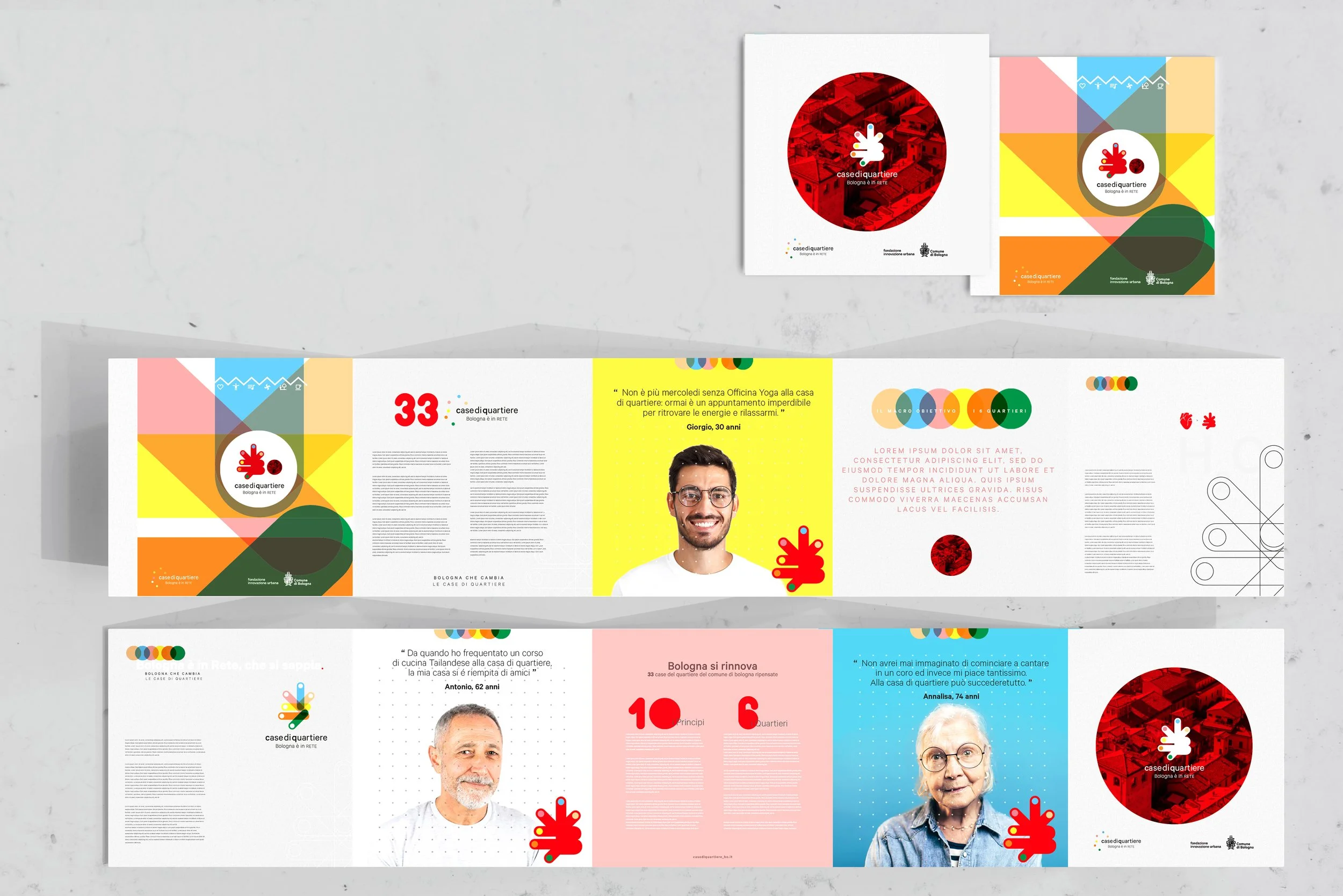
Un cuore con i suoi innesti, questo è Bologna, Bologna con la sua 'B', cioè proprio quel muscolo rosso che - per eccellenza - fa da connettore e ricircolo alla proverbiale vitalità. Un po’ Pop un po’ Corn, dal design fresco - colorato e scoppiettante - pulsa e sogna di rappresentare una comunità che esca dall'isolamento e torni a partecipare, condividere. A sorridere, insomma, prescindendo dall'età.
Alcune delle tavole confezionate per la partecipazione in team con la collega Cristina Lovadina al concorso indetto da FIU, AIAP e Comune di Bologna. L'obiettivo del bando era quello di raccogliere proposte creative per il marchio/logotipo e declinazione del sistema di identità di Case di Quartiere di Bologna con il fine di avere una riconoscibilità generale, ma una declinazione (cromatica, stilistica, grafica, etc..) differenziata per ognuno dei sei quartieri della città. Un progetto complesso ed entusiasmante.
A heart with its grafts, this is Bologna, Bologna with its 'B', exactly that red muscle that - par excellence - acts as a connector and recirculation of the proverbial vitality. A bit Pop a bit Corn, with a fresh design - colorful and crackling - it pulsates and dreams of representing a community that comes out of isolation and returns to participate, to share. To smile, in short, regardless of age.
An exciting project in team with my colleague Cristina Lovadina for the competition announced by FIU, AIAP and the Municipality of Bologna. The objective of the call was to collect creative proposals for the logo and identity system of Case di Quartiere di Bologna with the aim of having a general recognizability, but differentiated for each of the six neighborhoods of the city.
Graphics and concept: ©Stefania Trofino and ©Cristina Lovadiina _ 2023